Maximize the efficiency of your travel website.
In our recent article—How to Create a Memorable Digital Experience for Your Travel Website—we discussed several tips for grabbing (and keeping!) the attention of travel prospects, as well as providing an authentic digital experience when they interact with your brand online.
But how do we take that one step further to maximize efficiency?
We focus on conversion rate optimization.
Conversion rate optimization (CRO) is not about what the head honcho of an organization wants, nor is it about hunches or assumptions, nor is it about focusing on the number of website visits alone. CRO is about a strategic approach to improving your website’s performance, driven by real data from real users on your site. It’s about making decisions that are based on real insights and focusing on the quality of engagement users are having, rather than the number of users who are engaging.
With these nine helpful tactics, you’ll be able to create a seamless experience for your visitors, as well as successfully increase the conversion rate for your travel website.
1. Smarten up your search feature
When it comes to booking travel, your visitors need an easy-to-use search feature. Why? Because unlike many other industries, travel is dependent on several important factors, including location, time frame, number of travelers and budget. Once they’ve narrowed down this information, they can start finding information that’s relevant to their upcoming adventure. With so much online competition in this industry, it’s imperative that visitors can search for their desired travel plan options with as little confusion and distraction as possible.
The search feature should be one of the first things visible on your travel site’s home page, and strategically located above the fold. Your search feature should provide clear and accurate results with as little clutter as possible, and pricing results should be especially quick and easy to distinguish. Find a smooth way to keep the search bar on the page after it’s already been filled out and submitted—possibly in a sidebar area, so edits may be made to their travel specifications if necessary.
2. Implement a progress bar and save feature
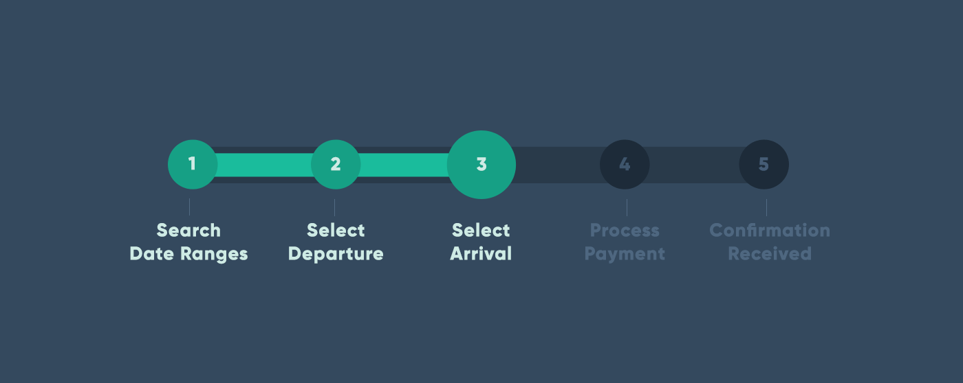
No matter what your business is within the travel industry, implementing a progress bar allows potential customers to see how many steps they’ve completed and how much more information is needed to finish their transaction. Keep your prospects from feeling overwhelmed by dividing the purchase funnel into steps that clearly inform them of where they are in the process.
In addition to a progress bar, a save button (or a “like” or “favorite” option) is a great way to entice potential customers who might not be ready to complete their purchase to come back when they actually are ready to buy. What’s more is that a save button encourages visitors to create an account with your website so they can come back later and revisit their items.
And if they’ve created an account, you can send a reminder email/app notification to the prospect that encourages them to complete their transaction if a visitor has had little to no activity after saving their items.
3. Upsell and cross-sell with style
The travel market is largely dependent on add-ons and your website design should take full advantage of that. Early in the transaction process, clearly offer additional benefits that can be taken advantage of with the visitor’s potential purchase. They should be relevant and catered to each visitor—not just an upsell that has nothing to do with their interests.
If you’re a hotel, for example, these upsells may include things like discounted dining packages for families, parking and breakfast upgrades, add-on spa services, etc. It’s not guaranteed an additional purchase will be made from these prompts, but they may spark interest and entice visitors to invest in an upgraded purchase at a discounted rate.
4. Be as clear as possible
When we’re talking about improving conversion, one major thing to consider is ambiguity. Yes, it’s important to have a pretty website design. Yes, it’s helpful to have photos of your location/services/products. But what’s more important is ensuring that you’re clearly communicating the action you want your visitors to make on your website.
One example might be an unclear call to action. Let’s say you’re an online travel company that offers vacation packages, but a visitor wants to know if they can remove an activity from the package to reduce the total cost. Don’t let your viewers click “X” due to confusion. Eliminate their stress by being as clear as possible, whether that means integrating a “remove activity” option or whether they need to call directly for more information. Leave no room for them to ask themselves questions about if their entries are correct.
One way to find out what’s working is to use A/B testing. This will tell you which buttons, copy and images are working best, which are not and which things to change in future iterations.
5. Anticipate last-minute bookings
According to an article on Skift, 44 percent of travelers in North America book at the last minute. In order to cater to this quick-booking market, try implementing an express feature for faster reservations. Minimize personalization and recommendations for this feature with a streamlined version of your transaction funnel. By catering to this need for speed, your website will surely keep up with last-minute travelers.
6. Welcome and recommend to repeat customers
Because returning customers are more often than not your best customers, it is important to cater to them on your website. What does that mean? It means making the login button clearly visible. It means providing an easy way for customers to leave testimonials. It means offering rewards to those who’ve earned loyalty with your organization.
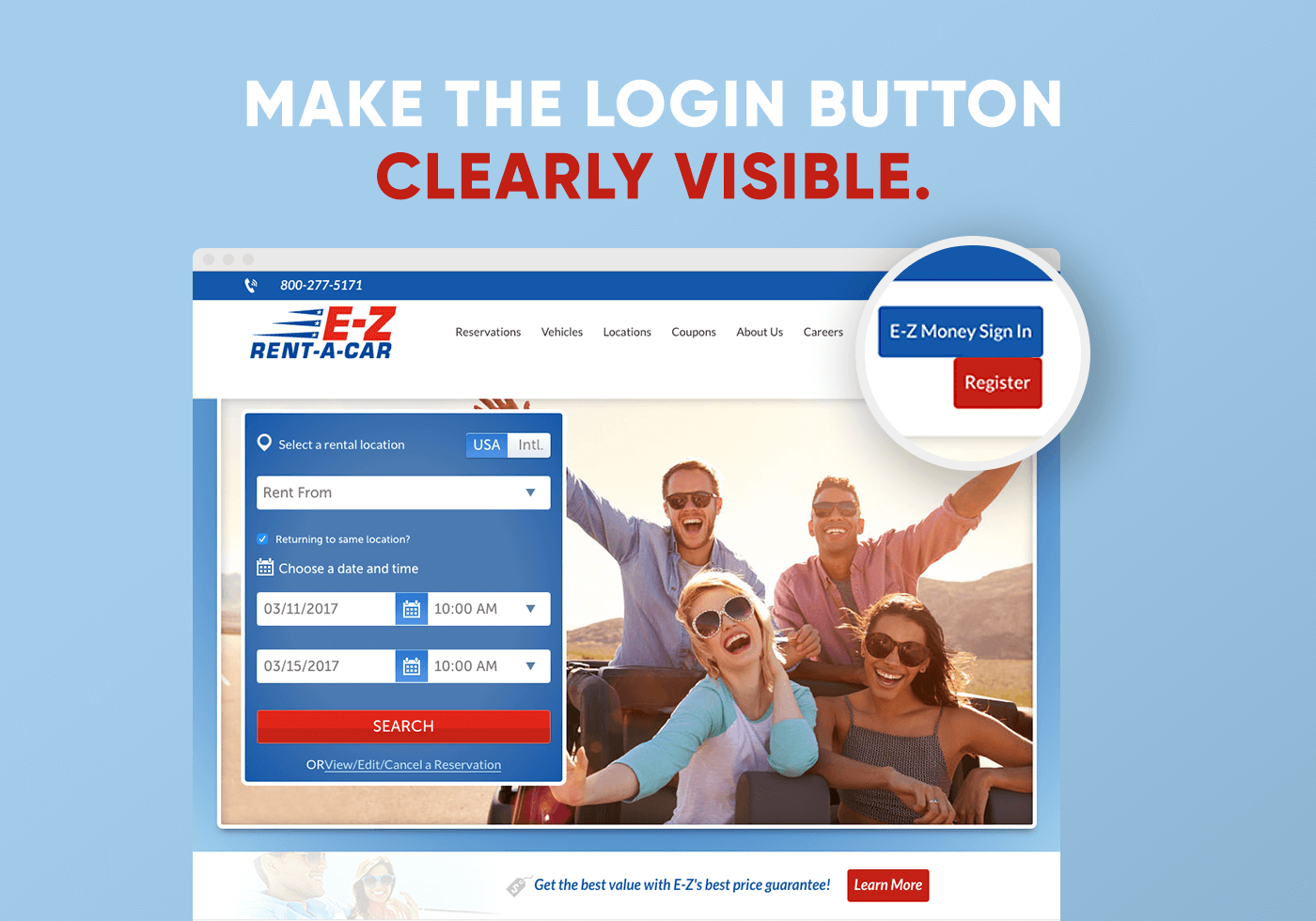
These are just a few of the great ways for returning customers to save time and have a more personalized experience, every time. Things like showcasing your login button is a perfect way to say “welcome back.”
7. Provide a simple and unique web experience
Your website is your digital salesperson. If people don’t see your home page and think “wow, this is a company I’d like to book my next vacation through,” they’re very likely to bounce from your site and contribute to the decline of your conversion rate.
Too often are travel websites packed with clutter, overwhelming offers and unclear CTAs. Travel searchers, like most online visitors, are looking for an authentic business they can trust. Use your branding to your advantage, be clear about the features and options you display, and offer content they can’t get anywhere else. Spending a little extra time making a booking feature unique to your company can help your website stand out among the endless travel booking options.
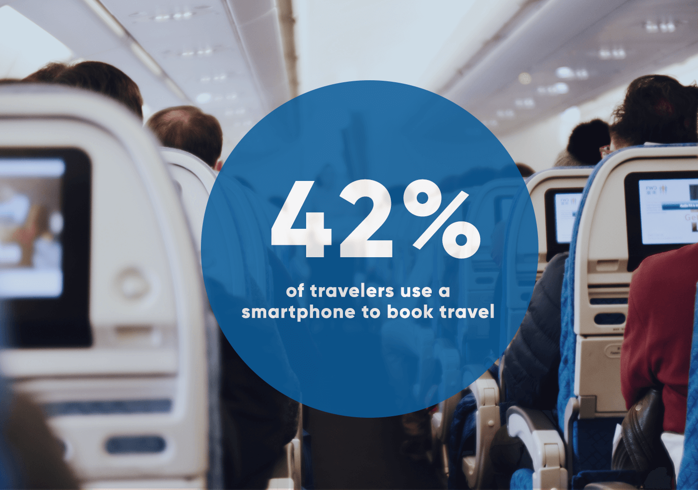
Additionally, because 42 percent of travelers use a smartphone to book travel, it’s important to make your web experience mobile-friendly as well. Viewers are valuing ease and convenience just as much as they are pricing, so it’s important to cater to that audience as well.
8. Use urgency and scarcity to your advantage
Creating a sense of urgency is a great way to encourage on-the-fence visitors to make a purchase. If you’re offering a travel package, suggest a free upgrade if they book within the next 10 minutes at checkout. Or, send a special-rate email offer for a limited time. Another great tip is to display how many users are viewing the same offer at the moment, which makes the offer seem more popular and encourages your visitors to purchase before someone else does.
These things set you apart from your competition and will help push your visitors to convert into customers.
9. Showcase your benefits
Why should visitors book with your company instead of another? Show them your unique value proposition right away and leave nothing left to be dug up on their own.
On your home page, or in a sidebar visible to your visitors, clearly display these benefits.
For example, if you’re a hotel and have recently received AAA Five Diamond rating, you’ll want to display that for viewers to see on your site right away. Or, if you offer transportation services to nearby attractions, that could save guests a ton of money and might be the reason they book with your hotel.
By doing things like this, you strengthen your brand’s image and address possible questions or concerns your visitors may have right off the bat.
Using these tips can help optimize the conversion rate for your travel website while making the booking process easier, faster and more informative for your visitors. Try them out for yourself now!
