When it comes to leaving a lasting impact on your blog viewers, content plays a huge part in making that happen. But when it comes to blog performance, design is the key to helping convert your visitors into regular viewers, and eventually subscribers and long-time customers.
If you’re using your blog solely for sharing information and not optimizing it to increase your conversions, then you’re missing out on a huge opportunity. Here are a few design tips to help you improve your site’s overall blog experience and, as a result, amp up your conversions:
Embrace white space.
Just like with web design, don’t be afraid to use white space in your blog design. More often than not, your copy will outweigh your imagery, so it’s important to make content as easily digestible as possible. Having a more narrow, column-like structure with your copy will prevent readers from feeling overwhelmed with too much content at once, and will encourage them to continue scrolling down.
On the same token, be sure to break up your blog with bullets, sub-headers, imagery and more to keep readers interested.
Use engaging visuals to your advantage.
At its core, your blog has to have great copy—from your headlines and your topics, to your body copy and CTAs. But it’s no secret that the imagery (when not overdone) tends to resonate more with readers than copy. That’s why it’s crucial that you dedicate just as much time to the messaging of the article as you do the visual elements. Here are some to include in your next article to help keep readers engaged and get them closer to converting:
- Photos (Note: Make sure your images aren’t too big, as load time can be a major factor in whether or not a viewer stays to finish the whole article or not.)
- GIFs
- Infographics
- Charts
- Illustrations
- Diagrams
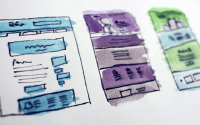
- Wireframes
Create strong CTAs with valuable resources.
When you have strong blog content, you want it to be supported by equally strong calls to action. These CTAs should be high-contrasting against your blog background so readers know exactly where to click to take action.
If blog’s background is white or lighter in color, make your CTAs pop by using a bright background (i.e. bright green against a white background). But just remember not to overdo it. As long as there is a clear message and a stark contrast in color, you’ll be sure to attract plenty of attention to your CTAs.
Make your newsletter signup easy and accessible.
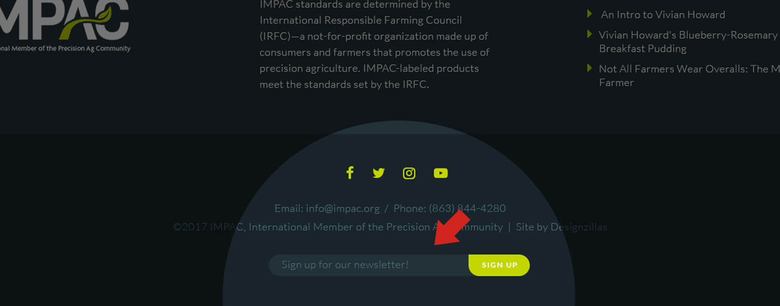
Your blog is the prime place to collect email addresses, so if you aren’t already doing so—get to it! When you have great content to share, loyal readers are much more likely to engage in email marketing efforts, returning to your blog time after time for more. Plus, if they’re willing to come back, they’re much more likely to share their email addresses with you—something you should take full advantage of.

There are multiple places to implement this newsletter signup. One location should be at the very bottom of your content—where most readers expect to find a next action to take. But, you can also take advantage of other prime real estate on your blog, including somewhere mid-way through or at the top of the sidebar. The goal with this is to make it very easy for readers to sign up, but also not overwhelm them with signup requests. Keep your signup boxes to about two per blog to achieve that.
Be strategic with your social sharing buttons.
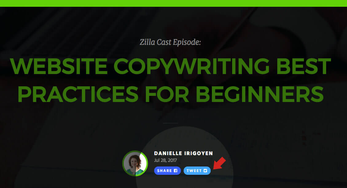
Another important way to help increase conversions is to make social sharing easy for your readers. While it should certainly be a priority to convert your visitors into subscribers, and subscribers into consumers, you should also prioritize social sharing, as it’s an easy way to gain traction for your content and increase newsletter signups. By adding social sharing buttons, you empower readers to promote your content for you, which promotes trust and credibility.

One way to do this is to use ClickToTweet, which is a great tool that lets you create a custom “Tweet This” links for your content, allowing readers to share your articles to their Twitter accounts with ease. Use the link anywhere within your blog content, especially at the end of an impactful sentence. A good rule of thumb for this is to keep your number of ClickToTweet links to about two per article, so as not to oversaturate your content with these links.
You can also have fixed social buttons that float at the side or bottom of your article as readers scroll through it. Using two to three of these social buttons usually works best—just be sure to use social networks that your audience is active in and that make the most sense for sharing content.
Learn more about the benefits of social sharing and social listening by reading our blog: 5 Ways to Use Social Listening to Help Create Your Content Strategy.
Test and modify.
After you’ve implemented the above suggestions into your blog strategy, the next step is to test it out and make adjustments as necessary.
Don’t just design a blog and expect it to be completely perfect thereafter. Instead, learn from your data. Understand what’s working and what is not, and make adjustments to better increase your conversions.
Perform A/B tests to see which ones perform better. Create two versions of a CTA; test the placement of your images or email signup boxes; experiment with different social sharing buttons; etc.
Eventually, you’ll be able to pinpoint what works best for your blog content and optimize it accordingly.


