Let’s imagine you just clicked on a website, but nothing works. The menu is nonexistent, buttons don’t go anywhere, there’s no useful information and you can’t even find a page with contact information. It’s so frustrating you probably leave, right? That’s a prime example of bad user experience.
What is user experience? It’s how potential customers feel when they interact with something. In this case, people are interacting with your website and that makes them your end-users. If you want a website that will drive growth, you need to root your business goals in user experience.
Getting an end-user onto the site isn’t worth much if they leave due to a bad experience. The site needs to feel as good to use as it looks. Putting a user’s experience (UX) first results in exactly that.
Designing a website with the end-user in mind will make it easier for them to navigate and for you to follow their Buyer’s Journey from website visitor to customer. Conversion rates correlate to user experience, so UX definitely comes into play with your business goals. UX is everywhere, and putting it first is the best way to meet your goals!
Ask Yourself: What Problem Are You Solving?
Building a UX-first site means answering the most simple questions an end-user might have. This is the most important thing your website can do. But answering questions and addressing pain points in the user experience will depend on your business goals.
A medical practice or pharmacy and a manufacturer will have different end-users, so their websites will address different pain points and solve different problems. However, it’s important to note both websites still give the user what they want!
Your end-user influences the structure and design of your site. A UX-first website that’s easy to navigate will convert more visitors than a website built with a salesperson in mind. This is because your end-user is the one using the site for solving a problem they have, not the salesperson.
What Does a UX-First Website Need?
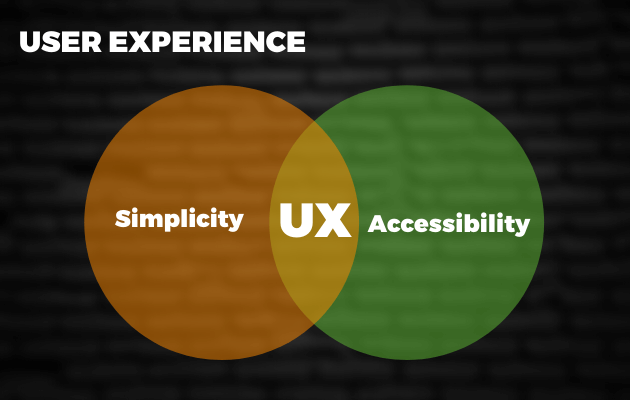
A UX-first website offers the simplest, most direct solution to accomplish a user’s goal. A UX-first website takes the user’s primary needs and challenges into account. You can think of this as a way to approach the “usability” or functionality of the website. This extends to two major factors: accessibility and simplicity.

Accessibility
Your site needs to be accessible for your end-user if you want a website that helps you achieve your business goals. That means looking at your entire site from your end-user’s point of view. If you can answer the following questions with a resounding “yes”, then your site is on its way to being user-friendly.
Can Someone Find What They’re Looking For?
This might sound like an obvious question, we know. But if your site is too cluttered or too organized, it can end up being a huge turn-off to visitors.
If you run an e-commerce website, finding a product and adding it to a cart needs to be easy. That means looking at how you organize your product pages, how you display your products and how you want visitors to look at your products. It’s worth putting extra thought into the navigation for your online store.
On the other side of the spectrum, if you want to schedule more consultations, it has to be easy for your target persona to request an appointment. Putting a form on your site isn’t enough; it needs to be in plain sight. Hiding your contact form on an obscure page won’t do you any favors or boost your conversion rate.
Is the Navigation Easy to Use?
Imagine a grocery store without signs on the aisles. You probably wouldn’t like shopping there. The same principle applies to your website. Your navigation should be easy enough to use that someone can find what they’re looking for without getting lost, clicking around on random pages. Form has to follow function.
There are a few different ways you can design your website’s navigation menu to optimize a visitor’s UX. You can use a dropdown menu or a mega-menu that hides options for when you have a lot of pages to add and not a lot of space. Or for extra responsiveness on your website, you can use a hamburger menu on mobile. While these menus all serve different purposes and work best in different situations, they still offer a great experience for a user trying to navigate the site.
Your site needs to be accessible for your end-user if you want a truly UX-first design. That means looking at your entire website from your end-user’s point of view.
Simplicity
Simplicity is what will keep website visitors on your site until they convert. It’s key that you don’t add intrusive pop-ups or CTAs that interfere with the user’s experience. Instead, you can guide them along their journey with streamlined conversion points.

Forms
Forms are a staple of any converting website. It should be easy to fill out for a user to take advantage of an offer. The key to building a good form is striking a balance between asking for too much information and not enough. For instance, if you ask for a user’s zip code, you don’t need to ask for a city or state in the form.
A form on a full-screen pop-up on your website can be jarring and intrusive to a website visitor if they’ve just arrived on your website’s homepage. However, forms in the sidebar or footer of a page are a lot cleaner and still serve the same purpose as a pop-up: they collect your visitor’s information.
Keep your end-user’s experience in mind and they’ll be more likely to convert. You still get the information you need to nurture that lead with the added bonus of a more positive experience for your end-user.
Sign-up Flow
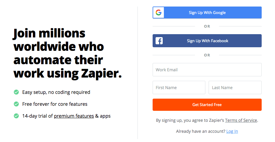
Your sign-up flow is the mechanism for how someone can convert from a user to a lead on your website. Zapier’s sign-up flow is simple, requiring a minimal amount of information.

There are only three fields to get started. Compare that to a more built-out form that might ask for a first name, last name, username, password and email. For someone looking to get access to an app or tool quickly, three fields are a low barrier of entry. In fact, HubSpot found that removing fields from their forms boosted their conversions by an impressive 120 percent!
Trying to scoop up all the data you could possibly get in a sign-up flow will inevitably alienate your site’s visitors. Keeping your flow short and sweet is the best way to collect the information you need like email addresses without trying your visitors’ patience.
Checkout
A successful conversion from visitor to customer hinges on the same principle as your sign-up flow. Except when it comes to a checkout flow, you need to take a few extra considerations into account, like cardholder information and shipping and handling.
Mandatory account creation and registration are two of the biggest mistakes to avoid making in your checkout flow. Requiring an account to checkout can actually make people abandon their cart altogether.
If someone has to create an account, verify it and then still enter all of their payment information just to complete a purchase, they could lose their patience and abandon their cart to find a website that doesn’t require as many steps at checkout.

Even if you don’t collect the information you wanted with account creation, you’re still benefiting from a successful conversion. The overall UX of your website can determine if a first-time customer becomes a repeat customer. That experience needs to be as positive as possible.
What Happens After Launching a UX-First Site?
A UX-first website is the first step to deploying a fully optimized marketing plan. When you first push your website out and into the world, you might be in a “honeymoon” period where you let the website’s design convert visitors into leads on its own. However, you can still do so much more with your marketing strategy and learnings from your users.
So what do you do?
Besides regularly creating more content for your website, it’s necessary to refresh your website to keep up with new UX trends. Continuous growth requires continuous efforts. A website ages quickly if you neglect it, and from there, your lead generation suffers.
It’s one thing to make a UX-first website. It’s another to maintain it with your other marketing campaigns to make it more effective. Your website’s UX-first design won’t stick if you let it sit there. It can actually defeat the entire purpose of designing for the end-user.
Designing a website with the end-user in mind will make it easier for them to navigate and for you to follow their Buyer’s Journey from website visitor to customer.
UX is the backbone of web design and a core component of digital marketing strategy. It converts visitors more effectively than a website designed for the salesperson because it’s designed with the end-user in mind.
Rooting your business goals in user experience will help you better understand why people become customers. Your end-users are who you develop products and solutions for, so designing their access to those products and solutions around their needs just makes sense. A better user experience translates into more web traffic, more conversions, more leads and happier customers.


