It’s no secret that Designzillas’ design team is a fan of Sketch App. We were raving about it back in 2017, and with every update since then, we’ve been testing and implementing many more awesome plugins that have saved our team overall time, energy and effort throughout our design processes and client workflows. We’ve compiled an updated list of our favorite plugins below for you to see exactly why we’re so excited about the latest additions to our ever-evolving design team workflows. Here’s the updated list for 2019:
Anima
This plugin has many functionalities that are great for creating responsive designs and high-fidelity prototypes. However, from all the features you can use with the Anima plugin, stacks and padding stood out the most for us, since they’re very easy to implement in your workflow and can save you a lot of time when creating UI essentials like buttons, tags, cards or any other elements that will be re-used or have multiple dispositions throughout a design.
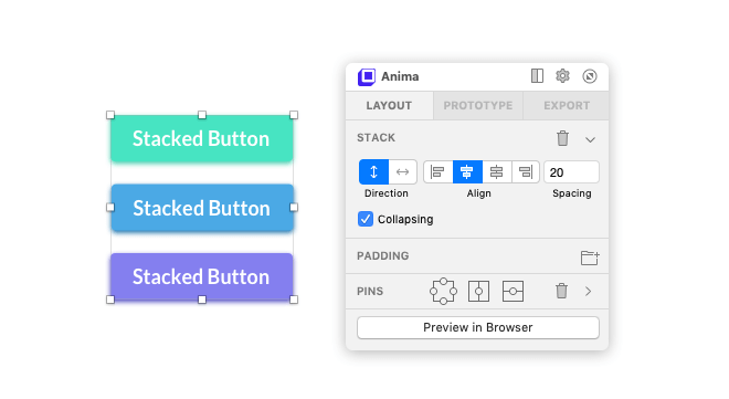
The stack feature can be used to define the vertical separation between three buttons.
The stack feature will help you define the direction, alignment and spacing of all child layers within a group. This can be very helpful when having to set the exact same distance between multiple elements that need to be stacked vertically (hence the name) or sit horizontally next to each other.
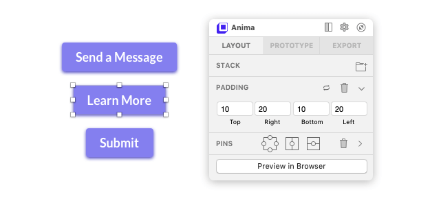
One padding distance to rule them all…
Forget about having to manually adjust the size of your buttons or other elements whenever your content changes. The padding feature will dynamically adjust and keep the same distance between the background and the text as you increase or reduce its length. This feature is ideal for buttons and for keeping consistent padding in buttons—regardless of content changes. It can also be used with anything involving text inside of a rectangle shape.
Stacks and padding work great together. They work even better when used inside Sketch symbols, as they create reusable, auto-padded components. Combined with the many other features that Anima offers, you will be able to create easy to edit layouts and save time in the process.
Prism
The Prism plugin is our favorite color-scheme generator. This plugin takes all of your document colors and generates color cards that you can quickly and easily implement in client branding style guides.
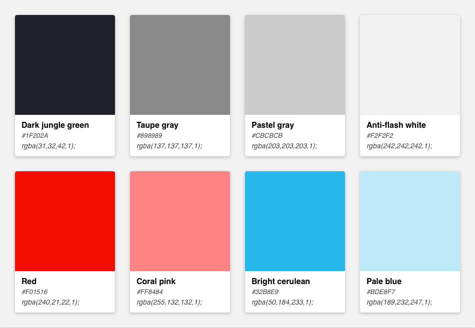
This is a Prism-generated color scheme based on the Sketch document’s document colors.
The generated cards come ready with color names, hex codes, RGB values and are generated in a matter of just two clicks. You can also override the generated color names to match any convention used by your in-house developers. Speaking of developers, Prism also lets you export CSS and SCSS partials that come prepopulated with color variable names and hex codes based on the data from the generated color cards.
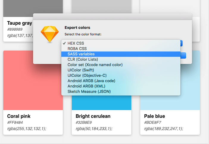
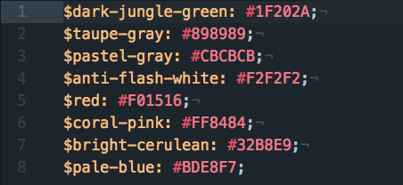
These are results of Prism generating SCSS variables from the color card data inside an SCSS partial.
Prism also exports Xcode, Swift, Android, and Object-C color files, so app developers can also use the exporting features to their benefit.
Sketch Palettes
While the Prism plugin is great for generating colors for developers and client style guides, the Sketch Palettes plugin excels at sharing color schemes between designers. Sketch Palettes allows you to export your document colors from your current document and import them to another one. If another designer on your team likes the color scheme you generated, export it and send it to them.
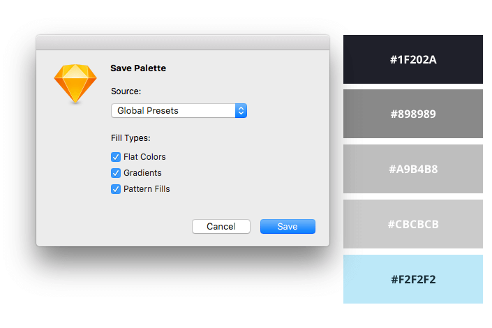
You can also export global Sketch colors. If your design team has a set of default Sketch global colors that include your company’s branding colors, you can easily export that color set and share it with new designers on the team in a matter of seconds.
Stark
Website accessibility used to only be considered at the start of the development stage. That is no longer true today. Both designers and developers can have equal parts of responsibility when it comes to ensuring the website is usable by as many users as possible. The Stark plugin was created to help designers manage the accessibility of their sites before it even goes into development.
Stark will compare two layers (like a text layer and a background layer) and generate their contrast ratio for you. It’ll let you know if your current font size and foreground-to-background contrast ratio are enough to adhere to both AA-rated and AAA-rated contrast accessibility standards for websites, as set by the WCAG.
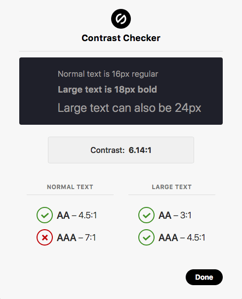
Here’s a screenshot of the results of running Stark’s contrast checker on an artboard’s text.
Their color-blindness generator is even more impressive. Stark will generate images that simulate eight different types of color blindness so that designers can see if colors are present enough, or if they create a user experience issue for different color-blind users.
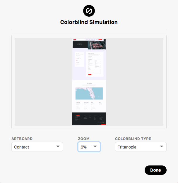
Here’s a screenshot of the preview Stark’s Colorblind Simulator generates for the tritanopia color-blindness type.
According to their website, future releases of Stark plan to include exports of color-blind-generated imagery, and WCAG accepted color suggestions for when your color contrast check doesn’t pass inspection.
Find and Replace
Sometimes you receive client feedback like,
Hey, can we replace the CTA button copy? Instead of ‘Get a Quote’, let’s change the text to ‘Get an Estimate’, on all SIXTEEN design comps?
And naturally, as a designer, you freak out. But there’s no need. The Find and Replace plugin will search for all instances of a text string, and replace it with whatever you desire automatically.
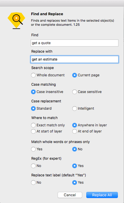
When finding and replacing, the plugin will give options to search the current page or the whole document. It’ll also set options for case sensitivity, and even update your text layers’ names as the find-and-replace process happens.
Spell Check Whole Page
We know the importance of carrying ourselves—and by extension, our team—in the utmost professional manner in front of clients and peers. That’s why we make sure that every little detail is considered when sending out proofs, and that includes one of the most important pieces of a webpage—the copy.
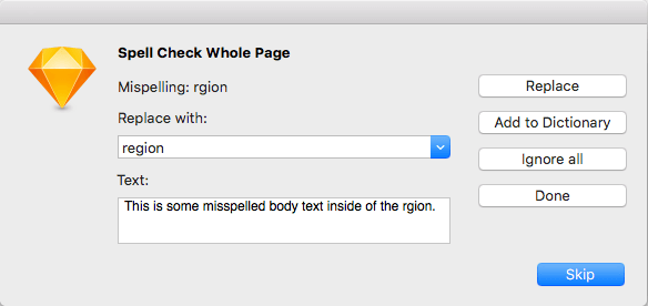
By default, Sketch doesn’t have any out-of-the-box spell-checking capabilities. So we’ve been using the Spell Check Whole Page plugin. It will look through any misspellings inside of your current Sketch page and suggest replacements. This will help protect yourself from glaring typos in client proofs!
Conclusion
We hope some of these plugins simplify your workflow and help you make awesome designs in no time. Check out the official Sketch repository of plugins and play with some of the awesome workflow enhancers developed by Sketch community developers. Tweet at us if you have any plugins you’d like to share with us!
