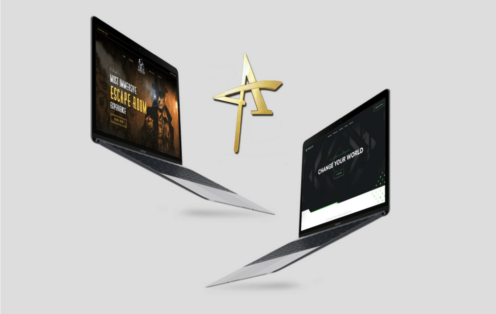
Imagine that web design is a dance routine, constantly evolving to include new and different types and styles to leave the audience floored. In order to leave a lasting impression, it’s essential your creations anticipate and incorporate the newest grooves and show-stoppin’ moves. So what trendy moves does 2018 have in store for designers? Here are a few that we’re seeing already.
Be Bold
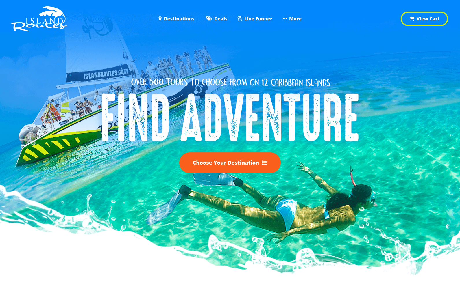
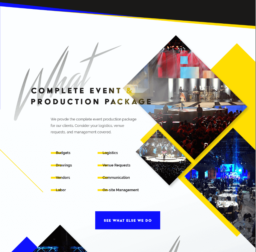
The digital world is jam-packed with content. So the ultimate question of 2018 is, how will your design stand out? One route to take is to not hold back. This year is about thinking big and acting bold. The easiest way? Typography. Try out large letters and contrasting headings to really strike that first pose for your audience. Maybe even throw in a custom font, as these are easier to read with sharper device resolution.
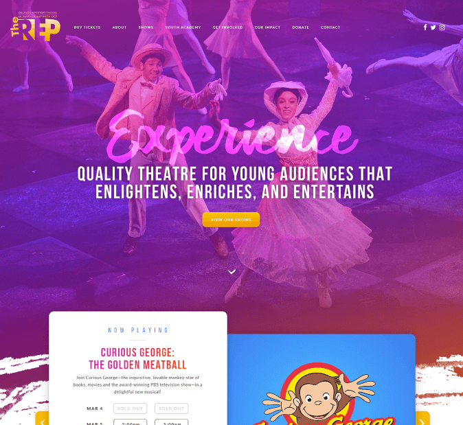
When visitors come to your site, they’re looking to be submerged in your brand, so consider using gradient washes, highlighting and shadowing to create depth beyond the screen to achieve that. Use saturated gradients and two-tone effects to your advantage in order to really kick your site’s aesthetic up a notch. The flat design trend is long gone. Shadowing with grids and parallax layouts will give you control of emphasis areas, raising the bar for UX.
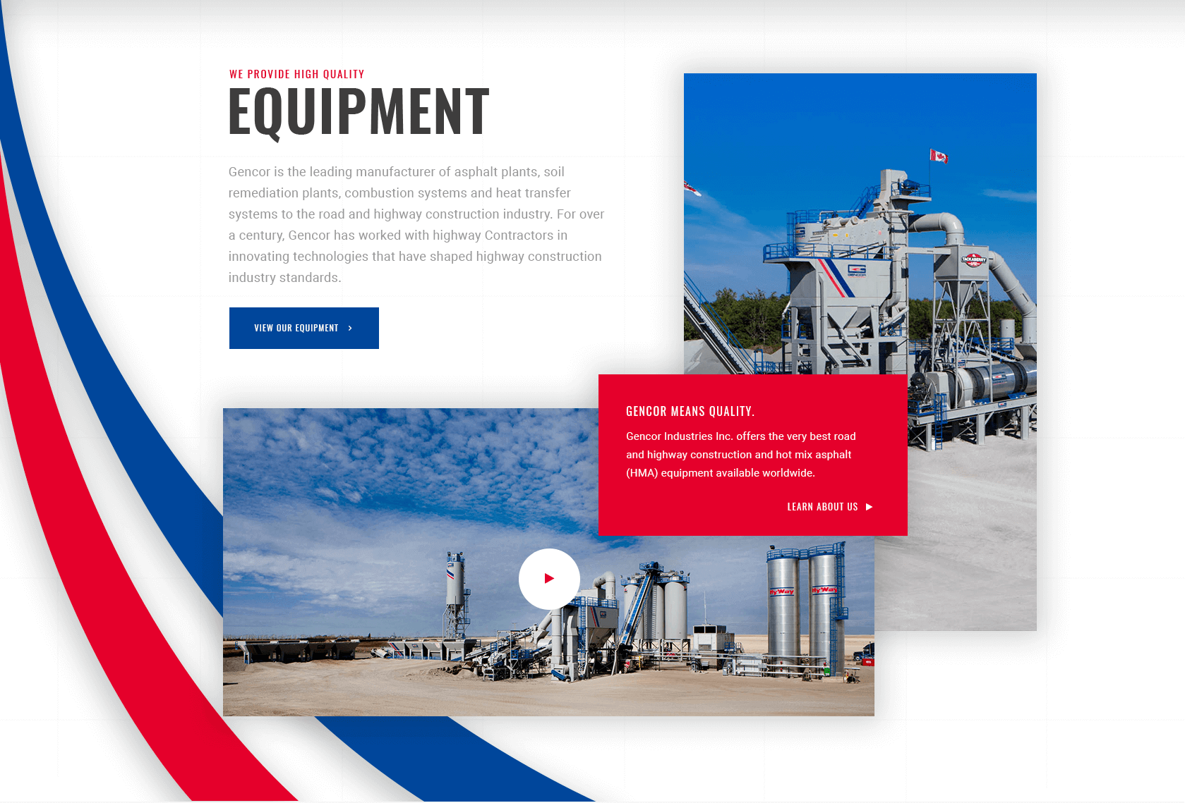
Another great way to captivate your audience is with color. Ditch the traditional vibes. Try vibrant, bolder colors, duotones, accents, stacked layers of color and texture to increase readability, create a modern look, and help your brand demand attention. Two-tone schemes are a great contemporary technique that can help your design stand out in a busy digital space. Combined with spiced up color choices, throw in some geometric shapes and hard angles to really strut your stuff.
Shake, Shake, Shake It
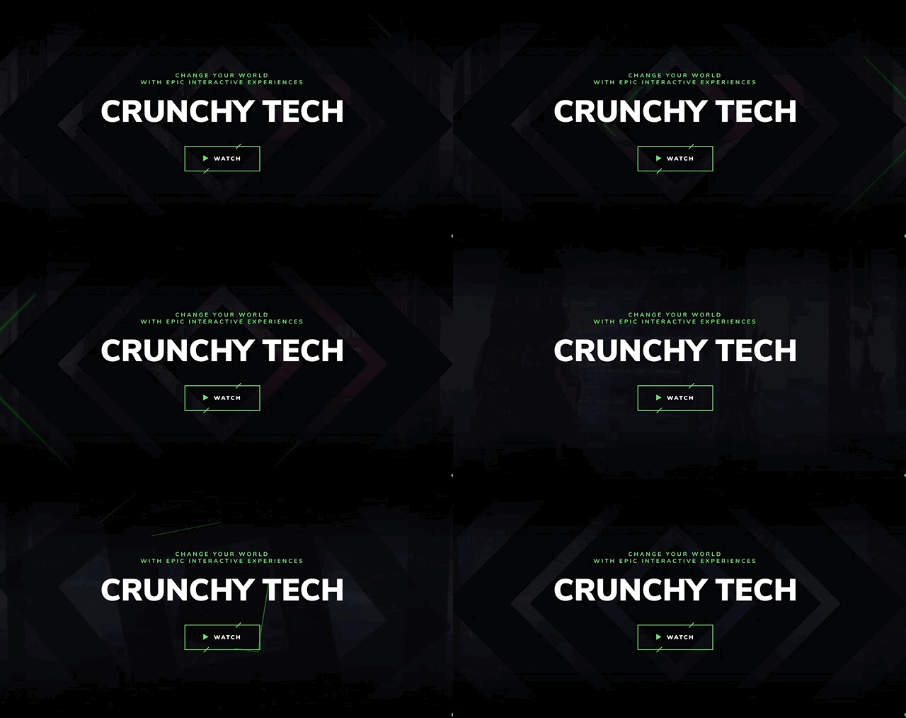
In addition to bold design, movement is a great way to spice up your design! Animations, custom illustrations, particle backgrounds and more—there are lots of ways to give your pages a shimmy. This is the easiest way to lighten the mood and help brands in industries such as healthcare, industrial, financial, etc. show personality.
Browser technology is advancing, and with this comes great new ways to spice up a static page. Cinemagraphs and particle animations in the background of pages can make simple, short content engaging and don’t impact load time. Allow your visitors to imagine themselves in the shoes of the characters you create via smaller, integrated animations. By integrating your animation to unfold as the page is navigated, your audience is more easily immersed in the story of the brand.
Switch It Up
2018 is throwing away the ballet shoes and taking a modern twist on design. Strict gridded layouts are a thing of the past. If the brand you’re designing for can afford to take a leap of faith, try incorporating asymmetrical layouts and organic shapes. Backgrounds, structures, and text in whimsical, unconventional formats appear distinct in the eye of the consumer.
And with viewer preferences always evolving, designers are constantly kept on their toes. Most viewers will end up viewing your designs from a mobile device, so it’s important to prioritize mobile UX when designing.
No longer limited by screen resolution, designers can now implement clashing serif and sans serif fonts to modernize the feel of headlines and page text. That’s right, serif fonts are back in action.
Like choreography, the choice is yours when designing—but it’s important to incorporate some of the new year’s trends to stay at the top of your class. At DZ, we’re always challenging and pushing each other to level up in our craft. We’re challenging our designers to include these new moves in their upcoming work, so look out for our newest designs and see if you can recognize these within them. Ready to try out these web design trends for yourself? Don’t just stand there—bust a move!

